In a previous DevLog (Player Movement), there was a fairly basic User Interface shown. It was functional, and served its' purpose, but we can do better!
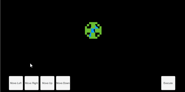
Previous UI; red arrows added after the gif was recordedThe UI shown previously was missing a few fairly important things! A way of seeing what actions were queue, how much power was left, and the player's Score.
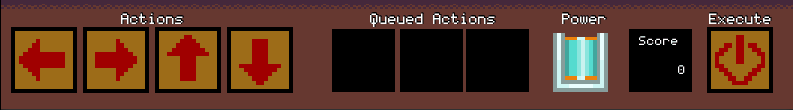
The new UI; font is 'Coder's Crux' by Chequered InkThe new UI is much improved, and now includes graphics and labels for the 'Actions' buttons, 'Queued Actions' display, 'Power' gauge, 'Score' tracker and the 'Execute' button. I chose to stick to the same restraints I had with the Sprites for designing the UI sprites (Which is mostly due to my limited ability when it comes to drawing sprites). The 'Actions', 'Queued Actions', and 'Execute' sprites are fairly straight forward. Using arrows for the movement directions seemed the best fit for 'Move up', 'Move down', etc. Likewise, a version of a simple 'Power' symbol is a good fit for the 'On' button for the movements. It then made sense to keep the arrows for the 'Queued Actions', but I decided that I wanted to differentiate them from the buttons by making them look like they're appearing in small 'screens'. I didn't do as well as I would have liked to convey that point, but I think it at least conveys the point of 'hey, these aren't buttons'. I recycled the blank 'Queued Actions' sprite to hold the 'Score' tracker to save a little bit of space on included sprites. I don't imagine it will make a huge difference, but every little bit counts.

The steps of the 'Power' gauge being drainedThe biggest addition to the UI panel is the 'Power' gauge. The 'Power' gauge was designed with the idea of it being a glass beaker being drained in steps. It works a little differently than most objects in the UI. Instead of keeping track of a value attached to an object in the game, it's technically a series of 10 single-frame animations that don't repeat, and each time the Generator loses power, the 'Power' gauge changes to the next animation in the series. This way, it indirectly keeps track of the Generator's power level.On the topic of Polish, there isn't really much to add to this DevLog. I was so focused on getting the UI looking coherent, that the only polish I was really able to add was the labels on the UI. There is one small detail which might not be immediately apparent, which is the faint shadowing on the lettering. This small detail was done by copying the text and putting it on top of the other, and setting the lower text to be bold. Layering the text that way lets the darker, bold text peek out from underneath the normal lettering, giving it the faint shadow effect which makes it stand out just that little bit more.
Next week; Testing and Planned Updates
Font used in the new UI; "Coder's Crux" by Chequered Ink,<https://www.fontspace.com/coders-crux-font-f16855>, Used under Chequered Ink's Non-Commercial License.
Leave a comment
Log in with itch.io to leave a comment.